There is a deep stylistic continuity between modern architecture and digital design. An in-depth study for all creative people, architects, designers, web designers and communication enthusiasts to navigate with more awareness the matter at the time of UI, UX and digital product design - technology.
"The Internet, so different from the print media to which you often
compares it without due caution, but nevertheless agrees with it
the peculiarity of giving individuals who use it
a power to control and dominate language."Derrick de Kerckhove
Because man has proven he loves the internet1? To inhabit it with pleasure? I deliberately use an improper verb such as love to anticipate another parallelism, with Adolf Loos2: "man loves everything that serves his comfort and hates everything that annoys him and wants to tear him from the secure position he has attained. That is why he loves home and hates art.".
It is important to stress the "conflictual" relationship that architecture assumes for him in relation to the arts, because it is in some way parallel to the contemporary use of the Internet.
The central idea is that art, as such, is the expressive manifestation of an individual, and this, precisely because of its individuality, can be liked or disliked, but remains the daughter of the expression of a single person, conceived by the spirituality of a person and given to the world. From this definition starts the separation from architecture: the latter, responding first to different needs, cannot be conceived as a mere work of art. It would lose its matrix, to serve those who will inhabit it: "Everyone has to like the house. Unlike the work of art, which doesn't need to please anyone. The work of art is a private affair of the artist. The house is not. The work of art comes into the world without any need for it. The house, on the other hand, satisfies a need [...]"3. It is precisely this having to "satisfy a need" that for Loos, living has nothing to do with art, or rather, the aesthetic/artistic value is placed in the background. For this reason an architect cannot, and must not, be considered an artist, precisely because his work, as opposed to a work of art, is brought into the world because there is a need for it. "The work of art is responsible to no one, the home to all. The work of art seeks to tear men from their comfort. The house is at the service of comfort. The work of art is revolutionary, the house is conservative. The work of art shows humanity new ways and thinks about the future. The house thinks of the present."4
In the same way man loves the computer and everything in it because figuratively speaking it represents a home. The house inside the house. The computer going beyond the purely hardware aspect, with its operating system and its windowed interface, the applications we need or don't need, is formally an infrastructured place, at all technical and aesthetic scales, where the user can:
- customize as you like, according to your taste;
- reach the information you want and that you consider most appropriate;
- manage the activities you perform as you see fit;
- develop if you want content. Any kind of content;
- Socialize and connect with other groups of people.
Basically choose what, who and how. In total autonomy, and without moving from your seat. It is, in a certain sense, an elevation of home comfort and probably also for this reason it has been so successful. Becoming to all intents and purposes a place, a cave from which man defends himself from the weather of the world. In which he dwells:
"To living, so it seems, we come only through building. The latter, building, has that, that is, dwelling, as its end. However, not all constructions are dwellings. A bridge and an airport, a stadium and a power station are constructions, but not dwellings; likewise, a station, a highway, a dam, a covered market are constructions, but not dwellings. And yet, even these kinds of constructions fall within the sphere of our living. This sphere goes beyond the scope of these constructions, and on the other hand is not limited to dwellings. The lorry driver is at home on the motorway, and yet this is not where he lives; the worker is at home in the spinning mill, but does not have his home there; the engineer who runs the power station is at home there, but does not live there. These buildings house man. He inhabits them, and yet he does not dwell in them, if by dwelling in a place is meant only having one's lodging there."5
Maximizing this concept taken from Heidegger, another effort is made towards the definition of living. Professor Anna Cicognani, from the Faculty of Architecture at the University of Sidney "proposes, among other possible ones, five criteria to qualify 'spaces': 1. The possibility of interaction, by which he means 'the possibility of physical transformations in space'; 2. 'Liveability' or 'occupiability' (the possibility of living in a space); 3. Capacity to build communities (which, he rightly points out, 'can exist beyond their geographical location'); 4. Of time and 5. Of space."6
Today the Internet is the proof that this space, this cyberspace exists, works and has rules that are very similar to the sensitive space we live in.
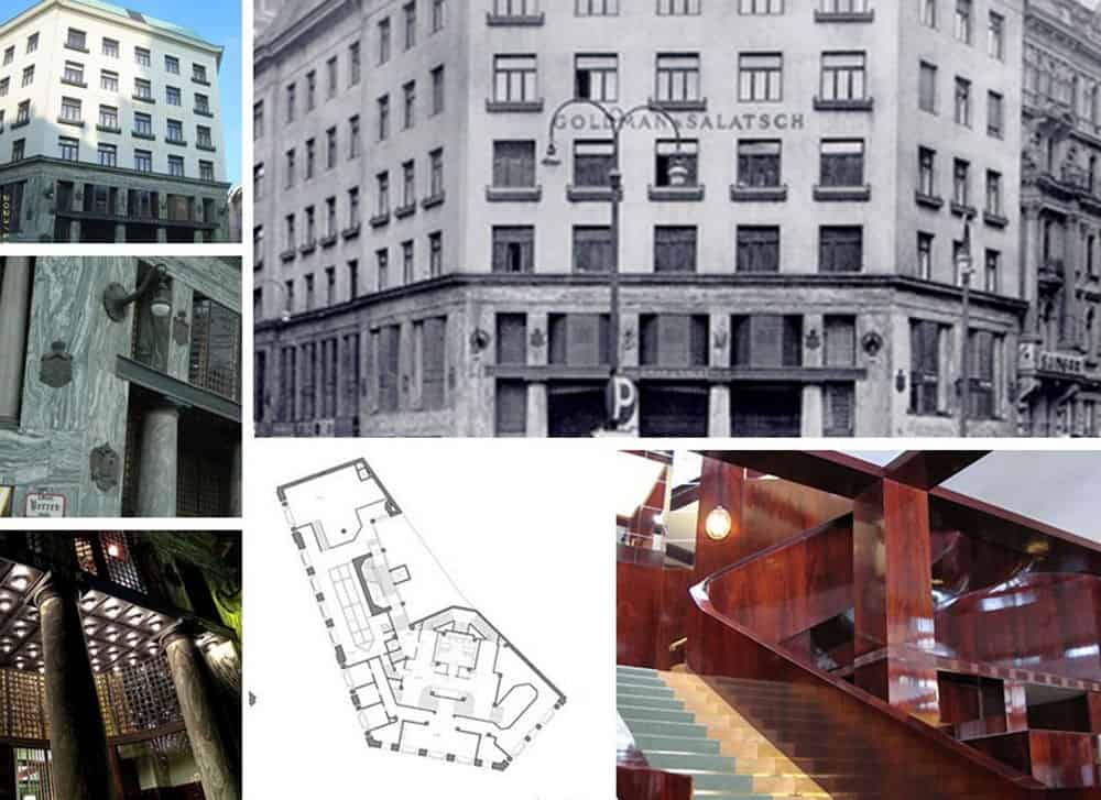
If I mentioned Loos is because in this last period there is a lot of talk about him in the blogosphere too7. Not so much of his buildings, but of the correlation between the modern style of architecture that he initiated and the aesthetic drift that internet sites and computer software, so-called flat design, have assimilated today.8.
Dmitry Fadeyev, webdesigner was the first to certify this interest thanks to his article entitled "authentic design" in Smashing Magazine9. And it has triggered a real interest in topics apparently so far away. Here is the article properly translated, revised and enriched, cut and stitched where necessary to be easier to understand with what was written previously:
The style of flat" interfaceThe recently publicized trend is not just a trend. It is the manifestation of a desire for greater authenticity in design, a desire to curb visual excess and eliminate the false and superfluous.
In creating new opportunities, technological advancement sometimes leads to areas of excess. In the 19th century, industrial production allowed the cost of ornaments to be brought down quickly and cheaply, thus leading to the creation of over-decorated goods. A similar thing occurred in the later years of computer and digital design, when visualization and styling technologies allowed designers to create visually rich interfaces, which led to stylistic excess in terms of decoration and excessive use of scheumorphic design10.
In its desire for authenticity, the so-called modern movement in architecture put the brakes on the excessive ornamental use of the 19th century, seeking to provide an architectural response to the era of mass production. Today, we're seeing the same desire for authenticity manifest itself in the trend of "flat" design, which rejects scheumorphism and excessive decoration in favor of design for the simple, clean, and content-focused.
The birth of modern design
In 1908, Adolf Loos, an influential Austrian architect, wrote an essay with the provocative title "Ornament and Crime". The modern ornamentist, he argued, was either a "cultural laggard or a pathological case. He himself is forced to disown his work after three years. His productions are unbearable to cultured persons now, and will become so to others in a little while". Even more courageously, Loos stated: "The lower the standard of a people, the more lavish are its ornaments. To find beauty in form instead of making it depend on ornament is the goal towards which humanity is aspiring."
What triggered this attack on ornament? To understand the mindset of this pioneer of modern design, we must first get an idea of the state of design in the late 19th century.
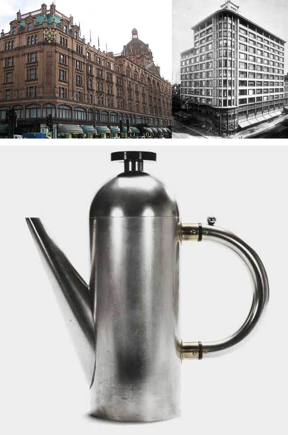
(b) Carson Pirie Scott store by Louis Sullivan (c) teapot by Naum Slutzky
The advent of the steam engine ushered in the era of industrial production. The art critic Frank Whitford wrote: "Steam-driven machines could stamp, cut and fashion almost any substance faster and more regularly than the human hand. Mechanized production meant lower prices and higher profits."
But while the method of production varied, the architectural and design style of objects of more or less common use remained the same without evolving. Most products, from the construction world to furniture, textiles and cutlery, were adorned with a profuse coat of ornamentation.
Historically, the handmade decoration was very expensive to producewhich at the time symbolized a state of wealth and consequent luxury. With the advent of industrialization, the cost and time to imitate these sought-after ornaments could be cut down. Instead of stopping and thinking about what type of design would be most suitable for mass production, manufacturers jumped at the chance to copy the historicised styles at low cost. The result was the jumble of gaudy, low-quality products that Adolf Loosalong with others that can be traced back to the modern movement (think of the Bauhaus), lashed out at.
In the book "The Decorative Art of Today", Le Corbusier bluntly stated that garbage is abundantly decorated, and that, "The luxury object is well-made, neat and clean, pure and healthy, and its bareness reveals the quality of its manufacture. It is to industry that we owe the reversal in this state of affairs: a cast-iron stove overflowing with decoration costs less than a plain one; amidst the surging leaf patterns flaws in the casting cannot be seen."
Montgomery Schuyler, an influential critic and journalist, also waged a battle against ornate 19th century facades, saying, "If you were to scrape down to the face of the main wall of the buildings of these streets, you would find that you had simply removed all the architecture, and that you had left the buildings as good as ever."
Again Louis Sullivan, architect known as "the father of skyscrapers," mildly "It would be greatly for our aesthetic good, if we should refrain entirely from the use of ornament for a period of years, in order that our thought might concentrate acutely upon the production of buildings well-formed and comely in the nude."
During the 1920s, a new movement emerged in Germany known as Sachlichkeit, which can be translated as "practical," "objective." This Neue Sachlichkeit movement performs research in the field of design by asserting that aesthetics must combine with utility. German Architect Hermann Muthesius explained how this idea of utility in aesthetics can produce something he called Maschinenstil, or "style of the machine." We find examples of this in "railway stations, exhibition halls, bridges, steamships, etc. Here we are faced with a severe and almost scientific Sachlichkeit, with abstinence from all outward decoration, and with shapes completely dictated by the purposes which they are meant to serve."
Other designers of the time, instead of attacking ornamentation, focused on elevating the concept of form/function. In 1934, an exhibition curated by modernist architect Philip Johnson was held at the New York Museum of Modern Art, entitled "Machine Art." Various pieces of mechanical equipment, such as airplane propellers and industrial insulators, made up the exhibition. The idea was to highlight the beauty of form in objects that were purely functional. For the modern movement, decoration in furniture was not necessary. The beauty and elegance emerges from the design itself, not by a superficial decoration.
Much of the first half of the 20th century saw the tastes and ideas of the modernist movement prevail, and traditional styles and techniques were eventually overtaken by these newer approaches. In his book "Twentieth-Century Design" Jonathan Woodham notes that the modern aesthetic was characterized by "clean, geometric forms, the use of modern materials such as chromium-plated steel and glass, and plain surfaces articulated by the abstract manipulation of light and shade. The use of color was often restrained, with an emphasis on white, off-white, grey, and black." Modern design had thus abandoned the idea of beauty in ornament and found beauty in a harmonious fusion of form and function.
It would be wrong, however, to think that only the modern movement in those years characterized their design aesthetic as "anti-ornamental". New styles came and went, such as the popular art nouveau or art deco movements. Some, like Futurism, pushed for an aesthetic aimed at exaggerated technology, while others, like De Stijl, sought harmony in a limited palette of colors and shapes. Underlying all of these, however, was the constant that theornamentation was now useless. The basic idea was that the form was a direct expression of the content, not the external decoration.
Digital ornament
If we compare the history of modern design, with our short history of software e web designwe can see a parallelism. In the same way that in the age of industrialization there was an excessive use of ornamentation, so with the advance of technology in visualization the result has been a heavy use of decoration to software interfaces and web sites. Designers in the early years of the Web were particularly exploratory on this front, with animation and sound combining with images to produce overly rich and often loud experiences.
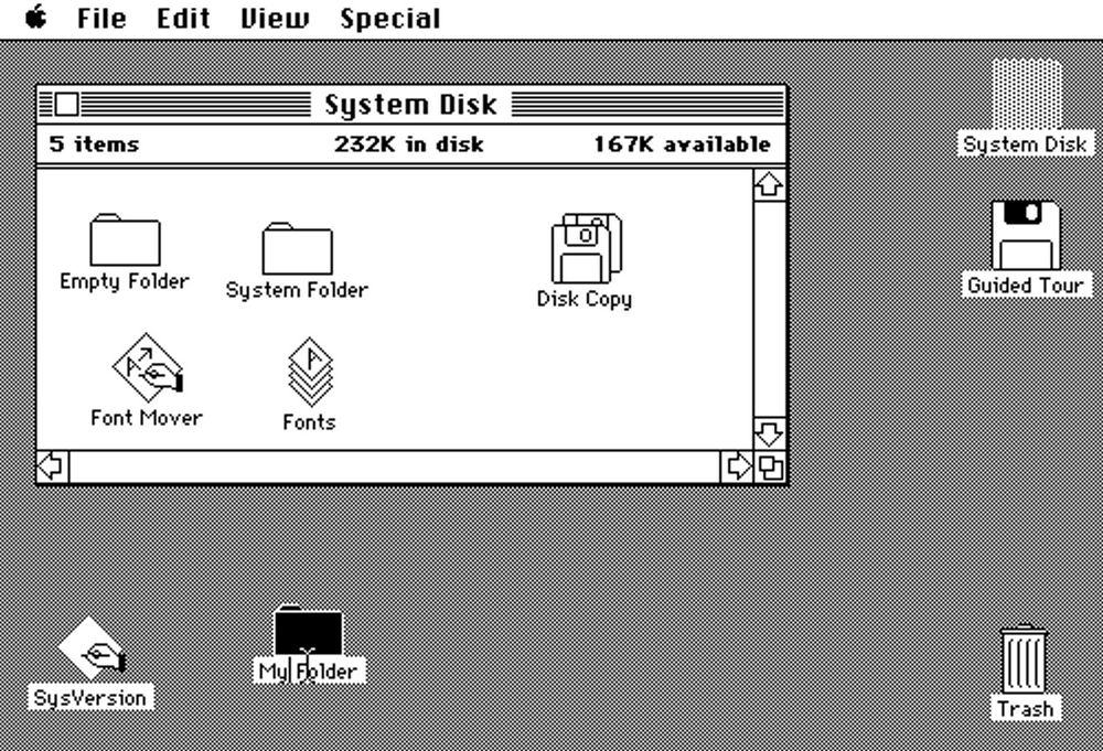
The first operating systems with graphical user interfaces were still rather simple in their look and feel. An attempt was made through metaphors from the sensory world to iconically recall commonly used objects, such as the folder icon to represent file directories. But the overall aesthetic was quite flat and linear. Regardless of whether the designer wanted to perhaps offer a richer visual experience, the low resolution of the black and white displays limited them.
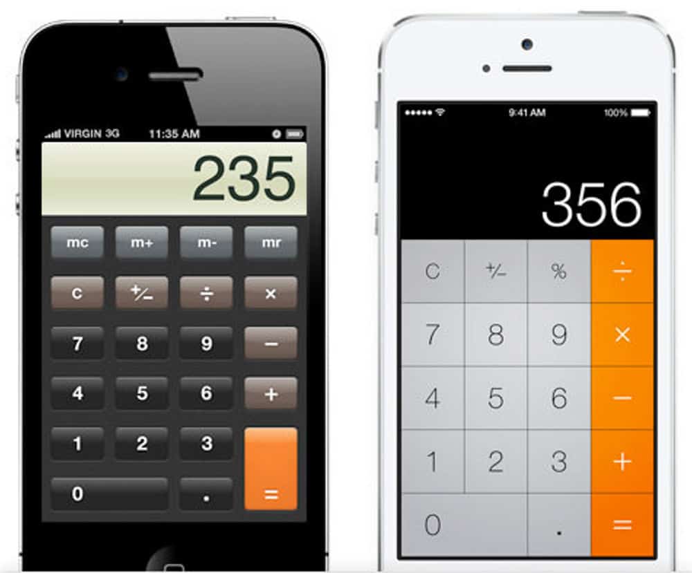
As technology has evolved, machines and operating systems have become more powerful and advanced, designers have allowed themselves more visual freedom with their interfaces. With Windows XP, Microsoft introduced a colorful style, giving it a somewhat "physical" look, with lots of lights, shadows, and shades.
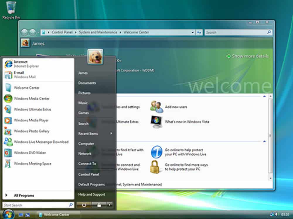
La Apple went even further with the release of Mac OS X, an interface with shiny plastic bubbles, brushed aluminum, and realistic icons. As time went on, the visual style of operating systems continued to grow in intensity. Microsoft gave Windows a theme similar to shiny clear glass, while Apple also introduced more materials and scheumorphic cues into its desktop and mobile operating system, such as textures that resembled skin in its calendar app and the effects of realistically turning pages in its book reader.
Styles that imitate real objects and textures are called "skeuomorphs" - that is, design elements based on symbols borrowed from the real world, for the sole purpose of making a familiar-looking interface for the user. Recently, designers have begun to question this styling logic. A notes application such as a pad of paper, or adding leather and page graphics effects that turn to a calendar application. These effects may provide an interesting visual experience, but they are also relics of another time, relics that tie an interface to "static" real-life objects that are incompatible with the fluidity and dynamism of digital interfaces.
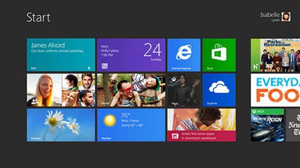
With the latest version of Windows 8, Microsoft has taken a bold step away from that scenario, trying to give its operating system a whole new look, and according to Microsoft a look "authentic". The latest interface is based on principles that Microsoft developed and applied for the previous version of its mobile operating system, which presents the user with an aesthetic that is almost entirely devoid of textures or imitations of real-life objects.
Windows 8 relies on typography, spacing, and color to bring order and elegance to our digital screen. Real effects and superfluous styles are discarded, and all that remains is simply the content. Just as for Muthesius the train stations were examples of Maschinenstil, Microsoft's designers have taken "the station" as the source of inspiration for the new Windows GUI, formally called and known as "Metro".
The Web has seen a similar transformation over the years. Initial html layouts based on tables and websites built in Flash11 have given developers virtually total control over interfaces, and so designers have not hesitated to create visually rich containers for their content. As we have started to grasp in recent years thanks to the fluidity of CSS it has been possible to disconnect the aesthetics of the elements (size, colors, layout) of a web page from the content, and so web design has become more sober. Containers decorated with shadows and smoothing effects (obtained thanks to images that were the background of the container) developed in tables could not change their width and position easily. With the advent of CSS, designers used fewer images and structured their sites to make their layouts more adaptable and easier to maintain.

The latest recent development is that of responsive design, or responsive design (which is the technology that allows you to adapt a single page to various screen sizes, depending on the device you're viewing it on), as well as the move among web designers to work directly on the code from the beginning, skipping graphic editors like Photoshop, pushes us even further toward an aesthetic idea of simplicity given form, which draws its beauty from typography, spacing, and color rather than heavy use of textures and decorative images.
More recently, Apple the leader in scheumorphism has, copying Microsoft, taken its first step towards digital authenticity with the latest release of its mobile operating system, iOS7. Gone are the stitched leather textures and torn paper edges, replaced by a minimalist, mostly flat interface with colors, simplified icons and semi-transparent surfaces.
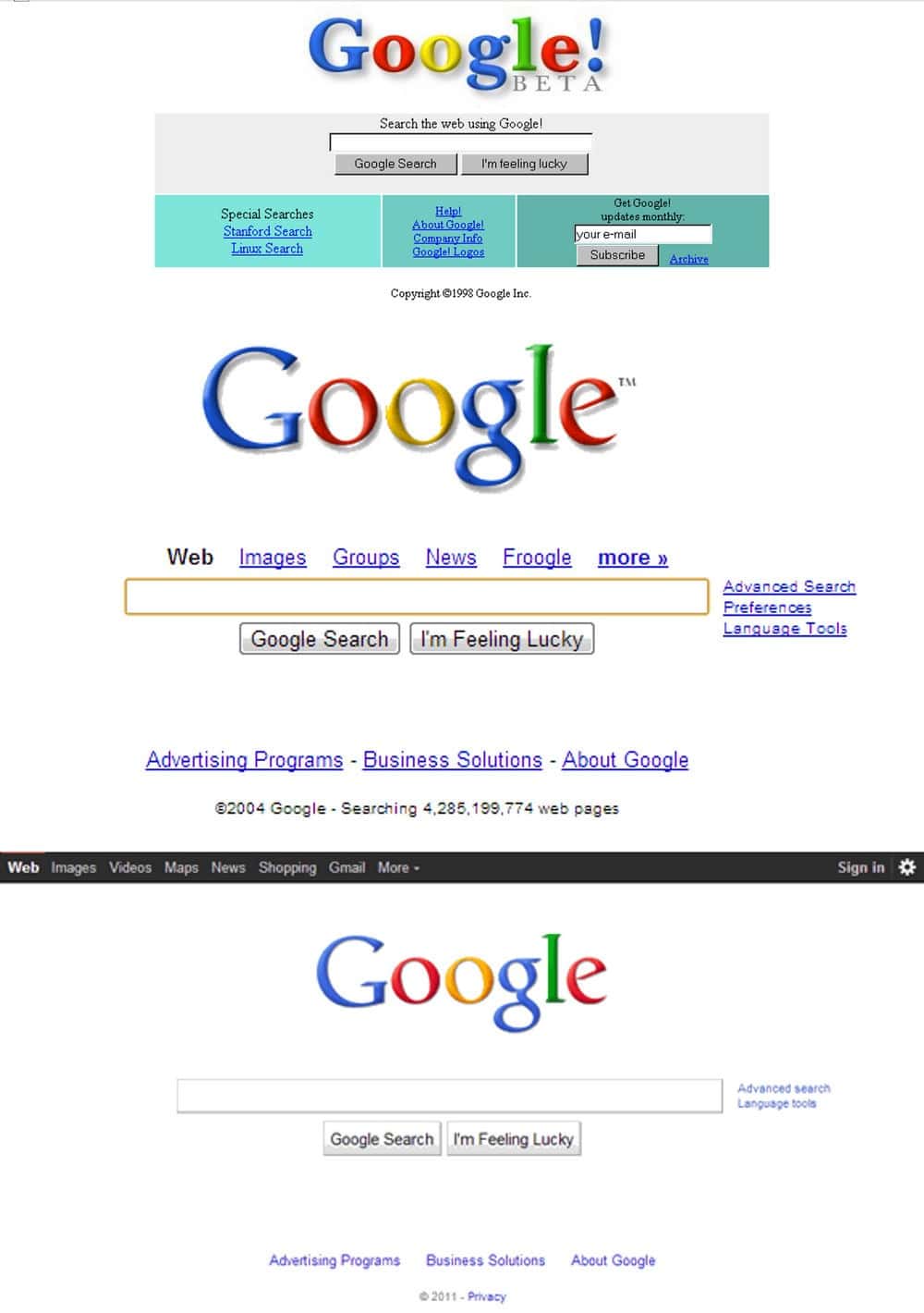
It is clear that in the last period many more people in the field are finding more and more ways to connect thearchitecture to the world of computing and the web. Without proceeding to a proper history of the evolution of the web design and the web architecture of the last 20 years, let's think about the most popular sites in the contemporary world. Let's think about the three most used sites on a planetary level: Google, born as a search engine and Facebook and Twitter, the two social networks. What do they have in common?
- Aesthetic successsimplicity and customization.
Simplicity has always been part of the presentation of these websites: Less is more. Despite the incredible technology behind the structuring of these three sites, the front end, what the user sees has been made as simple and intelligible as possible. This has allowed the user a simpler and faster navigation to what he was looking for. In addition, do not forget the customization according to your tastes. In fact, you can change views, colors. Fill our notice board with the information and content that we consider most relevant.
- Social successinteractivity and interaction
They are totally interactive places: in addition to being customizable in fact, they allow the personification of the user, who is no longer just a "data", but can actively participate in the social or search engine. Inserting any type of information, both textual and multimedia. From the most trivial elements upwards: your photograph, a description or your own content. It also allows interaction with other people, who in turn can be associated with other groups, generating membership.
- Information success: the simplicity of reaching information
Users can quickly access the information they need. Today, the web, thanks to social networks, search engines and the multitude of websites, can be defined as a large world library. Thanks to hypertextuality and multimedia, any type of information and of any character can be quickly accessed. The evolution of social media has also allowed this library to become social and therefore people have also become information, or rather, they produce information.
We return to another excerpt from Dmitry Fadeyev's Authentic Design article, which becomes valuable at this stage of the thesis:
Authentic design
What ties the modern movement in architecture to the current design shift in software and the web is the desire for authenticity. This push for greater authenticity is what drives designers to scrape away the ornamentation from the work that has characterized them for over a hundred years. This force is also driving digital design today towards cleaner form and more functional aesthetics. But what makes design more "authentic"?
Authentic design aims to cross the lie and do away with superfluity. Authentic design has to do with using materials without the need to disguise them in false textures, trying to showcase their strengths instead of trying to hide their weaknesses. Authentic design aims to eliminate features that are often included in a product just to make it look familiar or desirable but that don't actually serve any of those purposes. Authentic design has to do with representing functions in their most optimal form. And with the fact that elegance passes for function. Authentic design aims at dropping the support wrongly proposed by external ornaments and spurs one to find beauty within content alone. In authentic design, it is not that style is not important, but it is not pursued through decoration. On the contrary, the beauty of form depends on content, so that style is a natural outcome of the creative solution.
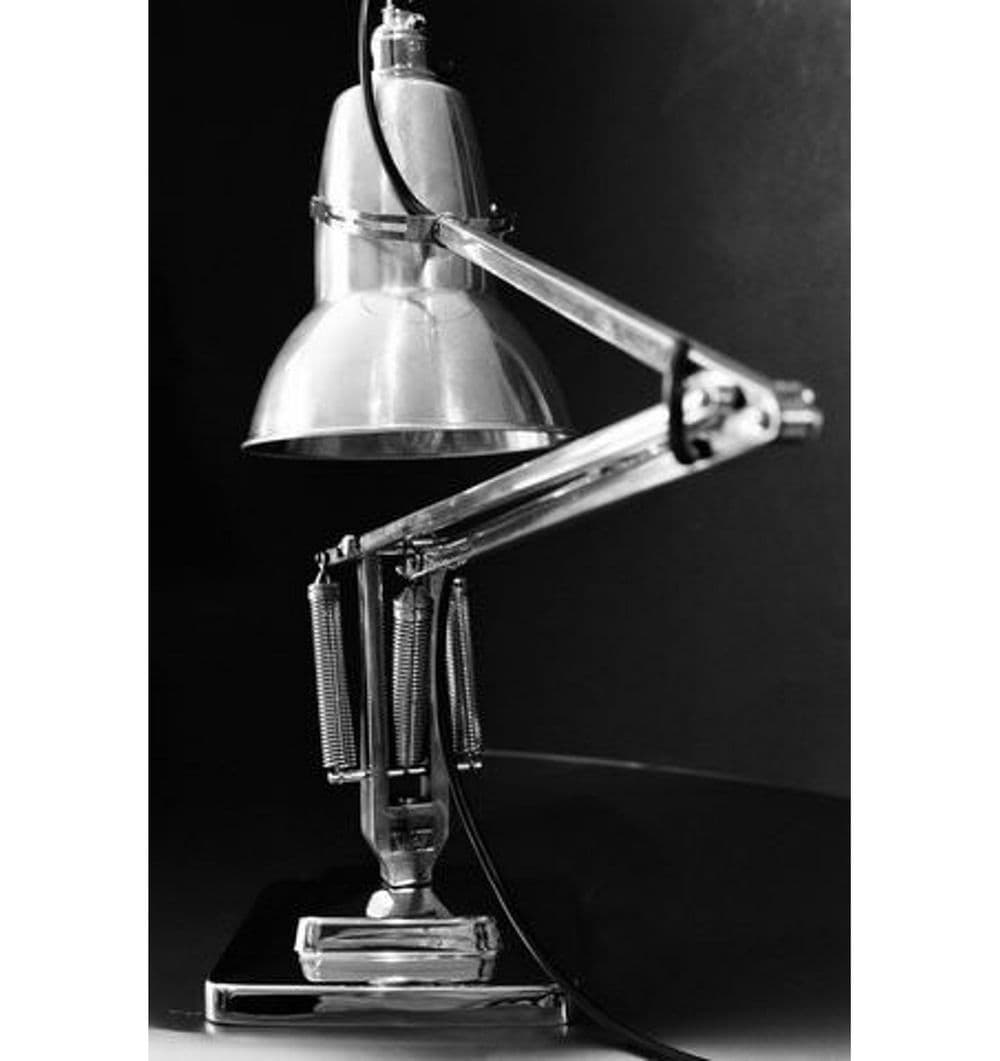
Deyan Sudjic commented on the design of the iconic Anglepoise lamp saying, "what the lamp looks like - particularly the shape of its shadow - is something that had more to do with an afterthought. But that was part of its appeal. The naive line gave it a certain innocence that suggested authenticity, much like the early versions of the Land Rover that had a credibility derived more from a basic design of a technically brilliant idea than on the desire to create an alluring consumer product."
In digital design, authenticity can be summarized in three concepts, which can be summarized more or less as follows:
- Embracing the digital aspect
There's no need to imitate textures like metal, wood and leather on the computer screen. These are not the materials that a digital interface is made of, and so it's just fake and meaningless. This doesn't mean that a design should only have backgrounds made of simple colors - rather, it means that we shouldn't try to imitate or be limited by textures from the real world.
- Ending the scheuformism
A digital book doesn't need to mimic physical paper in turning the page, nor does a note-taking app need to look like a pad of paper, with a leather cover, torn edges, and a similar graphic font. Scheuformism isn't always bad, but it always introduces unnecessary constraints to the interface. For example, while a pad of paper is static and one-dimensional, a digital interface is not, but as long as the interface mimics paper, it must endure the constraints imposed by the physical metaphor.
- Content is the center
Focus on the content, rather than its style and decoration. You might think this point is trivial, but how many times have you seen a ready-made theme on a website? A theme is always built on dummy content and so, by its very nature, could never be an optimal representation of the content it will end up containing. Building themes with dummy text pushes the designer to focus on design and decoration, rather than content, because there is no content to work with yet. It's only when you work with the actual content that you can begin to truly transform function into form.
Not minimalism
Design whose beauty lies in function shares nothing with minimalist style. When we talk about design and function we are dealing with a designer who tries to remove the superfluous, to make the product easier to understand, to make it easy to use and make the most of its contribution. The minimalist style aims to create a minimalist aesthetic, which gives the object an aura of simplicity and cleanliness. The first form of design is a fundamental principle of design, the other a stylistic choice.
It would be a mistake to rigidly apply a minimalist aesthetic design to an interface in hopes of making the interface simpler and more digitally "authentic." For example, ruthlessly eliminating certain visual features such as shadows, colors, and various background styles will not necessarily have and easy-to-use interface. In some cases it would result in the opposite, undermining hierarchy and focus, which are instead clearly enabled and facilitated by those same shadows and background colors. In "The Laws of Simplicity" John Maeda posits, "The easiest way to simplicity is through thoughtful reduction. When in doubt, remove. Only be careful what you remove.".
This final caveat is important. The act of removing often leads to simplicity only because you lead the user to deal with fewer elements to process. But removing visual cues that help the user mentally process the interface - such as graphic elements that group certain elements together or that differentiate buttons and labels and allow certain elements to stand out - could do exactly the opposite, giving the user more work to do. So instead of designing a design from style, you have to design it from some principles.
[…] The recently popular "flat style" may just be a fashion statement., but also a manifestation of the desire for greater authenticity in design.: the desire to curb superfluous decoration in order to focus on content. Technological progress sometimes leads to excesses, just as the industrial revolution that began in the 19th century led to the abuse of ornamentation, display and styling technologies did during the early years of Web and software design. But just as ornamental excess was curbed over time by the pioneers of Modernism, who sought beauty in functionality, today's excesses in software and the Web will be curbed in the future by an underlying desire for authenticity in design.
We can say, without necessarily wishing to argue for the formation of a modernism 2.0, that the web is following its own personal aesthetic history, extremely close to the architectural one. with the succession of eras and styles over time. All incredibly compressed into the span of 20 years or so. It's amazing how somehow[...] These forces that often recreate Time and Space, that can shape and alter who we imagine ourselves to be, begin long before we are born and continue after we expire."12
In view of all this we can conclude that, to all intents and purposes, the internet has become a tangible place, where there is a community that can be both active and passive, it has a space and its own habitability and consequently its design. This is fundamental because of the myriad of complex processes that generate it in all spheres, from the most technical to the most aesthetic and finally the most psychological.